Do you have a favourite colour? Or stick to a strict colour palette in your wardrobe? Or maybe there is a colour you don’t like?

Colour is a powerful tool. It can change our mood or represent different things in different cultures. Without realising it, the colour we choose to wrap our bodies in can mean a lot both to the outside world and how we feel in our everyday life.
One colour can mean so many things in different countries and cultures. If we take the colour Green for example, in China green is a sign of infidelity, while in Ireland it is a symbol of luck. In the USA it represents money or wealth, but in South America it is the colour of death.
While different colours can have different meanings, how a colour makes us feel is something entirely different. First, we will need a quick recap on what colour is.
Colour is our brain's interpretation of the signal that comes from our eyes when light enters it. When the light enters our eyes it triggers the release of a chemical transmitter, which creates physiological changes within us. It can change how we feel emotionally, physically, it can even affect our intellect. And the colour we wear or surround ourselves in affects all of this. Like I said, colour is a powerful tool.
Colour and You
There has been a lot of research into the psychology of colour and how it affects each individual. There are 11 main colours- Red, Pink, Orange, Yellow, Green, Blue, Purple (Violet), Brown, Grey, White and Black. We know colour is not limited to these 11 colours, there are millions of different tones of each of these colours. But research has shown these to be the main 11. Each of these colours has a different psychological effect on us and this can be positive or adverse, depending on how much colour we are exposed to and how strong it is.
Take Red. Red is strong, it can give feelings of courage, warmth and excitement. It is widely recognised as the colour of Love in western culture. It can also signify danger and anger. It signifies high levels of physical energy, which can be overwhelming. If you are constantly surrounded by a lot of red you would begin to feel these adverse effects.
“The Little Book of Colour” by Karen Haller looks at how the Psychology of Colour affects you and can transform your life. She lists the positive and adverse effects the 11 main colours have on us.
RED
Positive- Warmth, energy, stimulation, excitement, strength, physical courage. Adverse- Aggressive, defiant, demanding, dominant, impatient.

Bold Flowers Red Viscose Twill
PINK
Positive- Physically soothing, nurturing love, femininity, warm, supportive, compassionate and caring.
Adverse- Emotional fragility and neediness, physical weakness, physically draining.
 Nina Pink Pure Cotton Jersey
YELLOW
Positive- Happiness, optimism, self-confidence, self esteem.
Adverse- irrationality, anxiety, over stimulates the nervous system.
 Brush Petals Yellow Viscose Fabric
ORANGE
Positives- Playful, fun, physical comfort such as warmth, food and shelter, sensuality, abundance.
Adverse- Immaturity, deprivation, frustration, frivolity
 Woodland Notions Flower Buds Orange Cotton Poplin Fabric
BROWN
Positives- Warm, connects with nature, safe, reliable, serious, supportive. Adverse- Lack of humour, heaviness, lack of sophistication.
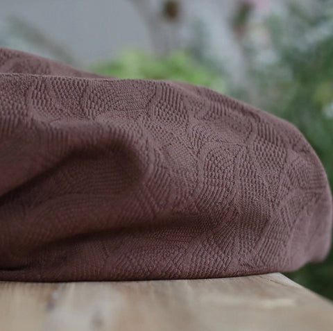 Mind The MAKER- Organic Leaf Jacquard Dust Brown
BLUE
Positive- light blue is mentally calming and serene, dark blue brings focus and concentration Adverse- cool, aloof, unfriendly

Intense Blue Organic Cotton Stretch Jersey
GREEN
Positives- Balance,equilibrium, harmony, refreshing, restorative, rest, reassurance, peace. Adverse- boredom, dull, lifeless
 Emily Green Viscose/Rayon Fabric
PURPLE
Positive- Spiritual awareness, wisdom, composure.
Adverse- Introversion, suppression, inferiority.
 Meet MILK- Purple Night Two Tone Check with TENCEL Lyocell fibres
PURE GREY
Positives- pure grey is psychologically neutral.
Adverse- non-committal, lack of confidence, hibernation, energy draining.

Stone Organic Cotton Stretch Jersey
WHITE
Positives- Hygiene, clarity, purity, cleanliness, simplicity, sophistication, efficiency. Adverse- Isolation, sterility, coldness, unfriendliness, elitism.
 Delphine Checks White Linen Fabric
BLACK
Positives- Sophistication, glamour, respect, aspirational, security, emotional safety, Adverse- Oppressive, cold, heavy, menacing, sinister, draining, intimidating.

Monochrome Checks Black Linen Fabric
There are two key points to remember when looking at the positive and adverse effects of colour. The first is balance. We all know too much of something is never a good thing. Even a small amount of a certain colour in your outfit is enough to have a positive effect on your psychological state without bringing on adverse effects. The second is that a colour is rarely viewed on its own. We are constantly subjected to an array of colours at the one time and when the colours work together this is when we achieve colour harmony.
Colour Harmony
Do you ever wonder why some colours just do not look right together? Or why are we attracted to certain colours more than others? Colour harmony looks at 4 colour palettes, similar to the colours we see in each passing season, and within these groups the tones of each colour work in harmony with each other. We are attracted to certain colours based on our personality type. There is a test in “The Little Book of Colour” to help determine your personality type, or various tests can be found online. If you are ever going to “get your colours done”, you also need to take this into consideration. Yes, certain colours will suit your skin tone, eyes, hair, but do these colours suit you? Your personality?
The 4 colour palettes/personalities are:
-Spring/Playful


Austin from Circle Line Rayon Fabric, See You At Six- Thin Grid Popcorn Yellow Double Gauze, Temple from Circle Lines Rayon Fabric, Blooms Green Cotton Jersey Fabric.
-Summer/Serene


Animal Print Olive Green Viscose Poplin Fabric, Meet MILK- Purple Haze Hoya Jacquard Linen Blend with TENCEL Lyocell Fibres, Nani Iro- Birds Eye Turquoise Double Gauze Fabric, Cloud 9 Fabrics Sweet Rose Rayon/Viscose by Cassidy Demkov.
-Autumn/Earthy


Tapestry Rust Viscose/Rayon Fabric, Maize Mammoth Cotton Flannel, Minerals Downtown Brown Viscose Jersey Fabric, Abstract Shapes Viscose Twill.
-Winter/Minimalist


Somewhere Blue from Circle Lines Rayon Fabric, Cotton and Steel- Neko and Tori Flower Picking Orchid Rayon Fabric, Ditsy Blooms Cobalt Viscose Fabric, Tulip Pink on Ecru Viscose Poplin.
There is a chance when you look at these colour palettes you will know which one you will be. If you take a test to determine which you belong to you may find you have one primary colour palette, along with a secondary one. When I (Sharlene) looked at the colour palettes I was instantly drawn to one- Autumn/Earthy, and secondly the cooler tones of Summer/Serene. These personality types describe me perfectly, and realising why these colours appealed to me so much was a little mind blowing. Who would have thought our own personality would decide the colours that suit us.
Within each ‘personality’ there are different palettes, as seen below. I did a test online to see what colours suit my skin tone, eye and hair colour to see if the results matched. It came back with my ideal colour palette as “Soft Autumn”. I already know that these colours do suit me, but I also know that a “Deep Autumn” palette is good for me, along with the ‘dusky’ pastels that feature in the Summer palettes.
 An overview of the different colour palettes from Adriana Cizikova.
When you find your true colour palette/personality type, get one of the colours and hold it up to your face without make-up and in natural light. You will find that your skin appears to ‘glow’. The energy from the colour will create such positive feelings within you that you actually glow! If you don’t see this glow it is possible that you have not yet found your ‘true’ personality type. You need to answer the questions truthfully without overthinking or answering how you think you ‘should’ answer.
What I love most about the above colour palettes is you can make your ‘colour personality’ work all year round. The colours from ‘Deep Winter’ are in fact perfect for the winter season, while the ‘Bright Winter’ and ‘Clear Winter’ are perfect for spring and summer. I found with the standard colour analysis based on your appearance you would be limited to a set of colours that may not work for every season. Check out the recent blog by Vicki “Sewing A Seasonless Wardrobe” for more ideas on how to achieve this.
Putting the theory into practice
If you see someone in an outfit that is giving them this ‘glow’, it can be tempting to try the same thing in order to look that good. However if the tone of these colours do not work for your personality you will not have the same glow.
As sewists this is where we have an advantage. We can see an outfit we like in terms of the style and shape, but choose colours that work for us to recreate the look. We are not at the mercy of what is currently “trending” in RTW (ready to wear). I have often felt that buying multiple dark green fabrics was a little silly, did I really need that many dark green garments in my wardrobe?! But the fact that I know this colour works so well with my personality now and has such positive psychological effects I understand why I have always been drawn to it.
 A selection of my favourite colours.
Over the last 2 years I have experimented with more colours, mostly pinks and lilacs but struggled to find the right shade for me. I now realise I need the warmer or dusky shades.
Knowing the right colour palette for me will make future colour experiments a lot easier, as I know the right tones to look for.
Another thing I have noticed is I am looking at printed fabrics and how outfits are put together in a completely different light. I have seen outfits that I feel should work but there is something not quite right. The colours belong to different palettes and don’t achieve colour harmony.

My current ‘wishlist’ based on my colour palette- Mind the MAKER- Shadow Splash Rosewood ECOVERO Leia Crepe, Meet MIlK Deep Green Two Tone Check with TENCEL Lyocell fibres, Floral Field Black Viscose Twill Fabric, About A Dot Lilac ECOVERO Viscose Twill Fabric.
I am also curious about the colours in my palette that I am not usually drawn to. Different tones of red appear frequently in the Autumn palettes, along with rich purples and shades of teal. I would not typically choose these colours, but I am curious to see how they would work for me.
One piece of advice I would give to anyone who is struggling with their wardrobe choices or feels like there is something missing is to look into how colour is affecting you psychologically.
We would love to hear your views on this. Or if you have any questions keep an eye out for an Instagram Live session where we will discuss this topic and answer any questions you may have.
Sharlene
Dear Sharlene, you have used my color palettes which were actualy 20 years ago!
colours from my palette Bright Winter and Clear Winter’are not perfect for spring and summer, they are suitable for Bright Winter and Clear Winter to face. They are booth cool with different chroma.I use another color palettes, 22 colour groups.
For you are maybe more helpfull boars on Pinterest, where is a huge amount of colours in 4 categories – Spring, Summer, Autumn, Winter.
https://sk.pinterest.com/adrianacizikova/spring-tips-fr%C3%BChling-tips-jar-warm-clear/
https://sk.pinterest.com/adrianacizikova/summer-tips-sommer-tips-leto-cool-soft-muted/
https://sk.pinterest.com/adrianacizikova/autumn-tips-herbst-tips-jese%C5%88-warm-softmuted/
https://sk.pinterest.com/adrianacizikova/winter-tips-zima-cool-bright-%2B-cool-dark/
These 12 palettes represented only a part of colours for these types – near the face, under the chin.
Great blog post! Last year I realized I really needed more of “my” colors in my life and started to figure out what those were and my sewing has gotten much more fun. It’s also so much easier to buy fabrics now I know what’s working for me. So I’ll definitely check the suggestions you did for the spring/summer 😊